The Fogue Abode: April 2016

Friday, April 29, 2016

UNplugged

This past weekend, we decided to load up the camper and take a trip...into the woods...into the deep dark woods.


Ok, maybe not the deep dark part.  But, we did load up and go camping out at our local lake.  It was a stunningly gorgeous weekend.  We really tried to unplug from the world and enjoy our family!  There might have been a few Gruffalo stories involved.  And plenty of s'mores!


After such a nice retreat, I highly recommend taking an unplugged vacation of your own.  It was so refreshing and relaxing. 


Here is a little snippet of our week...totally unplugged and unfiltered.


Hope all you have a wonderful weekend!

Wednesday, April 27, 2016

#projectbathroomreno - Paint Selection

When in doubt, create your own!

I'm about mid-way through painting the cabinet.  I am painting in multiple steps which I will detail next week.  While I'm in the painting mood, I decided to try and narrow down our paint selection.


I guess the last time we discussed paint colors, it was here.  I had taped up a hand full of paint swatches in the blue/green/grey pallet.  Good granny was that bathroom dark back then.

Once we got the lighting updated, I finally had it narrowed down to 2 colors and stopped by Sherwin Williams for a couple of samples.


I slathered them up on the wall and lived with them for a couple of days.  By the end of the week, I still wasn't loving either choice.  Balmy (on the left) was too blue and Tidewater (on the right) was just to dark.

So I took matters into my own hand and did a little paint mixology.
 

I took Balmy(1)  and added a little white to make (3) and took Tidewater (2) and added a little white to make (5), which toned them both down.  On a whim, I mixed Tidewater and Balmy together to create (4).  Are you confused yet on the numbers?  Thankful I didn't become a math teacher, mind-blown.


Call me crazy, but I think I like the 4th color the best of all.  It's more of the color I was leaning towards.  A spa-like blue/green to give this bathroom retreat a relaxed feel. 

I made sure to paint the back of my old paint chips so that we can get it color matched.  Now, for a name for our new paint color...what are your thoughts?

Which color is your favorite?

Monday, April 25, 2016

Design On A Dime: Pillow Talk

Welcome back for yet another round of Design on a Dime!  I just love thrifty ways to update a room, don't you?  Today's topic is certainly one of those that I cringe at the sticker price when I need to buy new pillows.  So, let me share with you my little secret for updating those generic decorative pillows.


When we purchased our family room couch set, many moons ago, I wanted to update the pillows that come with the couch.  They didn't really fit with the style of our family room, but we loved the couch and love seat so much that that didn't deter us from our purchase.  Two years later, and I still haven't updated those darn pillows.  The couch has held up nicely, those pillows - ehhh - not so much.


What had been stopping me from purchasing all new pretty pillows, have you seen the price of pillows recently (here I step up on my pillow soap box yet again.)  I just don't understand the rip off of a simple decorative pillow.  In enters my brainstorming session on how to update them on a budget.

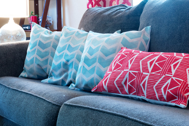
The simple solution, pillow covers.  My Amazon search lead me to these adorable pillow slip covers for just $7.99. (Unfortunately, we  got the last of the covers with this design, but there were several others from the same seller .)

 
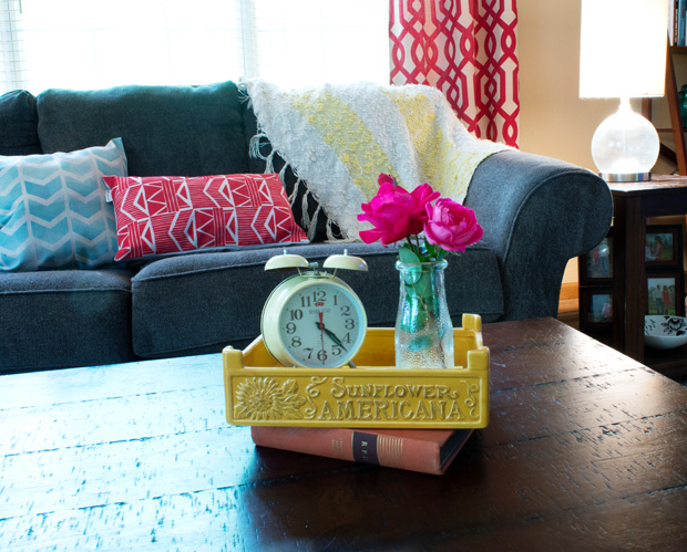
Two days later, thanks to Amazon Prime, I was able to give our couch a major facelift with the simplicity of a few pillow upgrades.  This look is much better than those shabby pillows the couch came with. 


Have you used pillow covers to give a generic set of pillows a personal upgrade?  I would love to see your thrifty makeovers.

Friday, April 22, 2016

Chelsea's "Fixer Upper" Family Room Mood Board

Happy Friday, whew, we finally made it through the week.  Today I am back with some design ideas for a dear mommy friend. Chelsea writes:

"I should ask you your opinion on my living room.  It's the largest room in my house and needing to be updated.  It's a horrible shaped room, 13' 9" wide - 29' 9" long.  I'm unable to do flooring or furniture.  Paint (it's eggshellish now.)  The wall has 2 doors, a French double and a pocket.  Behind the couch is the kids toys.  Color wise, I'm pretty open.  I have a teal room."
Since Chelsea is the mom to 6 kids, I thought we could really utilize the length of this room and separate it into two distinct areas, a living area for the adults and a kids zone complete with cubbies and a work station (much like what Haeley over at Design Improvised has done to her family room. )

Here is what the room looks like now:


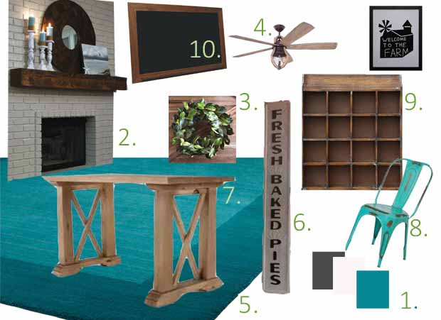
Here is how I suggest she fix it up:


And the layout plan (kept relatively the same with some tweaks):

 
So how are we gonna Fix Chelsea Up?
 
  1. With such a large room, we can really have fun with a color pallet.  I'm thinking a dark elephant skin grey for the walls.  Trim and doors in a Simply White by Benjamin Moore (my go to white,) and accent with her favorite teal.  With this scheme, she can add hints of red, yellow or even green.
  2. I think the one aspect, besides a fresh paint color, that will really make this room "wow" is painting the entire brick fireplace white and adding a barnwood beam mantle.  This would create a fun place to change out decorations and really draw your eye and give the living area a focal point.  Flanking the fireplace, I suggest Chelsea add some built in shelves.  She could still house her tv and equipment to the left but it would provide symmetry to the area.  If she's feeling wild and adventurous, she could even paint the wall of the shelves a beautify teal blue. 
  3. I had to throw in a good magnolia wreath to the collection from Antique Farm House.  Not only would it be perfect above that mantle, but it's a great way to add a little secondary color to the room.
  4. If budget is willing, I would change out the lights/fans in the room.  I was surprised to see the trend in ceiling fans are turning stylish and funky.  I love how charming these rustic wine barrel ceiling fans are from Shades of Light. She could use one over each section of the room to really help define the individual spaces.
  5. I would suggest a fun teal rug to go in the main living section.  Since Chelsea can't change out the flooring at the moment, rugs are always a thrifty way to change up the bottom side of a room without committing to something more permanent.  The teal rug would also add her splash of color.
  6. No farmhouse is complete without a Fresh Baked Pies sign. Antique Farm House is a great source for some fun and vintage signage.  If you watch their daily deals, you can find some killer pricing.  Also, any local flea market or thrift store may have some fun goodies.
  7. For the Kids Zone, I would add a farm table and create a fun little workstation for all the kids to gather around and do homework, color, or craft.  This is a cute wooden desk like table, but really any thrifty find could be painted and turned into a cute workstation.
  8. To keep her pops of teal going throughout the whole room, these fun teal industrial chairs would be great for the workstation.  Or, to be more thrifty while sticking with a vintage theme, she could find mix-matched chairs all around and paint them in different shades of teal.
  9. Along the fireplace wall, since it is so long and empty, these cubbies, also found through Antique Farm House, would be perfect to help organize all the kids toys and books.  Using industrial labels could also be a fun way to individualize them and influence the kids to keep their belongings picked up.
  10. Above the cubbies, I think a large vintage chalk board would be fun and rustic.  This piece could serve multiple uses: it can help create a mobile command center to keep up with activities and events or it could serve as a fun spot for drawings. 
 
Well, that rounds out another fun Farmhouse Mood Board.  Can't wait to see what you guys think?  As always, comments are welcome!


Post contains affiliated links; meaning, if you choose to purchase from these links, I could make a small commission.

Wednesday, April 20, 2016

Vintage Baby - Baby Shower

Happy Wednesday!  Looks like we finally made it half way through the week.  For me it is dragging, because we have a pretty fun packed weekend ahead, including taking A on her first camping trip. 

But before we get to those shenanigans, I had to share with you the absolutely charming Vintage Baby Shower that I helped host this weekend at Church.  I'm still giddy over how adorable this shower turned out to be. 
 
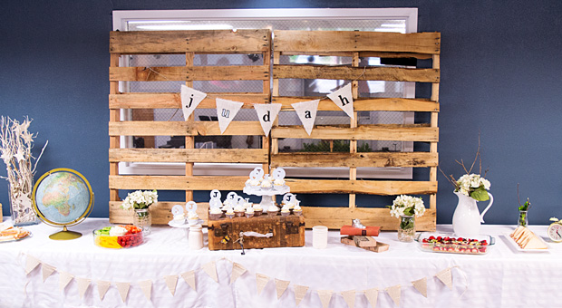
We prepared for baby Judah with a classic vintage baby theme.  We used simple items from around the home to decorate with and it was so charming.
 

Pallets were used as the backdrop and to help give the table setting dimension.  I just used vintage pieces I found around to fill in the space.


How cute is this vignette?  I used a pair of baby shoes, my old alarm clock, and an "I love you to the moon and back" sign that I borrowed  from A's room.


Remember the DIY pendant banner I designed Monday? Well, I loved using these banners so much, I had to make some for my home.  I also included the clothes pinned stars from the Twinkle Twinkle Little Star shower.


The cupcakes were topped with J's for Judah and we used an old suitcase to help layer them onto the table.  I don't know which was more scrumptious, the cup cakes or the old suitcase?


We used a strand of bulb lights tied up with blue and white ribbon to encircle the gift table.  I was really at odds with how to use these, but winding them around the table and around the card birdcage was a simple solution.


Baby Judah received a wonderful shower of blessings and joy and plenty of gifts and gadgets to start out his precious life. 


Love our party ideas!?  Need help designing your next party or event?  for more info on how we can be of assistance.

Newer Posts Older Posts Home